About product
Singpass is Singapore’s national digital identity system created by the government of Singapore. It is part of the Smart Nation initiative that aims to leverage technology and innovation to improve the quality of lives for those living in Singapore. Singpass has two key features:
- Single sign on — Use the app as a passkey to log into government services or government-approved services. No need to remember passwords.
- Digital identity cards — Use digital identity cards as an official alternative to physical cards.
About project
The Singpass app was going through two major revamps — a complete overhaul of the visual design language and a newly revised information architecture. There was no mechanisms in place to support these incoming changes, and therefore this design system was born.
What did I do?
I proposed and created the Singpass app design system in conjunction with the app’s new user interface and information architecture to lay a solid foundation for the growing team of PMs, engineers, and designers to build the app’s new features on.
Impact
The design system was built, used, and refined continuously between April 2021 and August 2021. It was officially launched in August 2021, and it is currently used by two product teams today.
Highlights
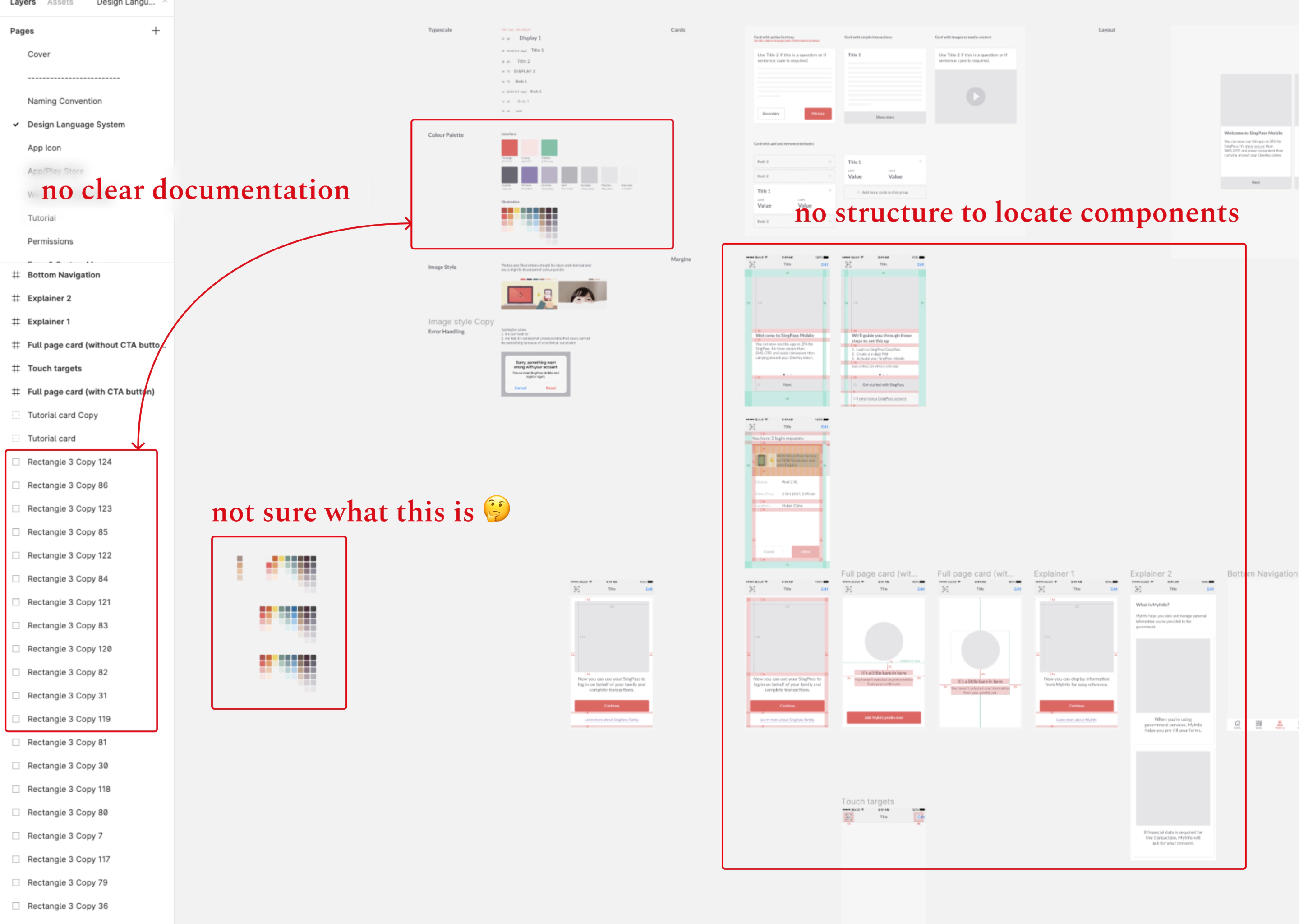
Before
The product was in its MVP stage and there was a small component library shared amongst two designers where visual consistency was not emphasized. Design files did not have clear documentation, nor were organized for findability.
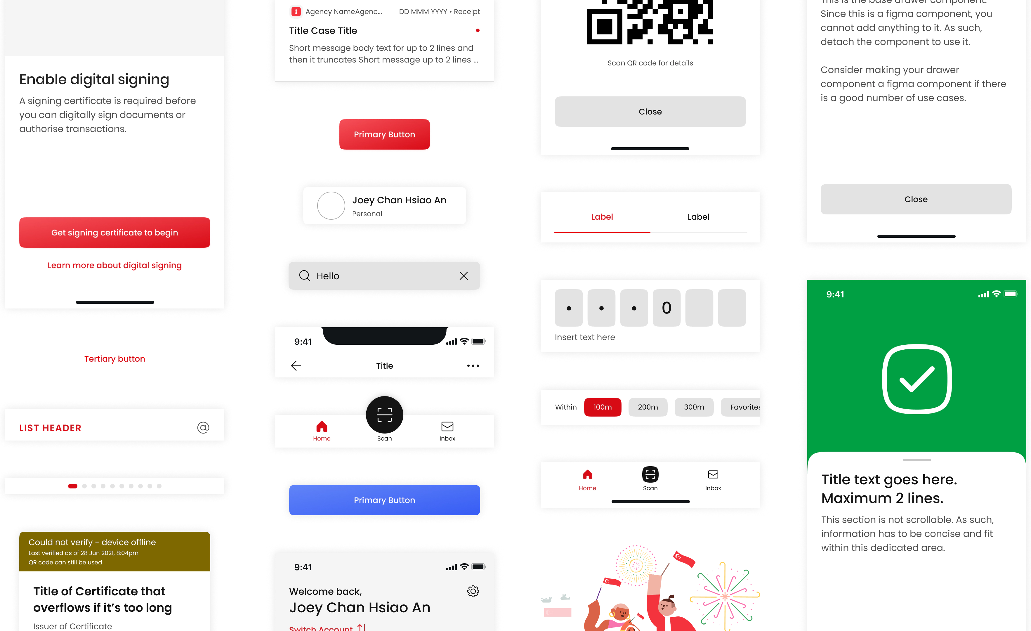
After
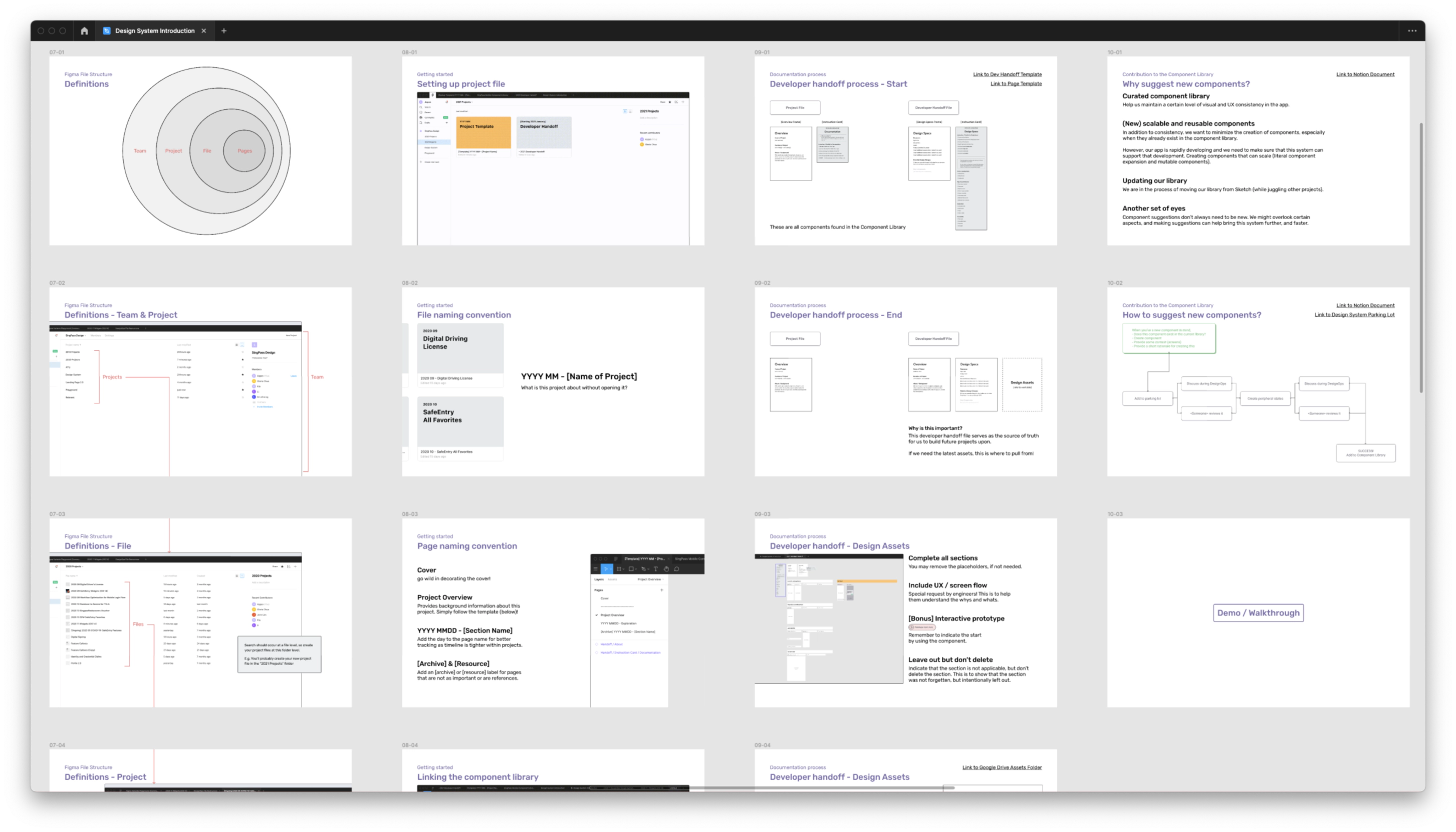
Here are some artifacts of what the design system looked like:
Research phase
Learning & desk research
I had informal conversations with my teammates to learn more about their design workflows and how they were using design resources then (benefits and drawbacks).
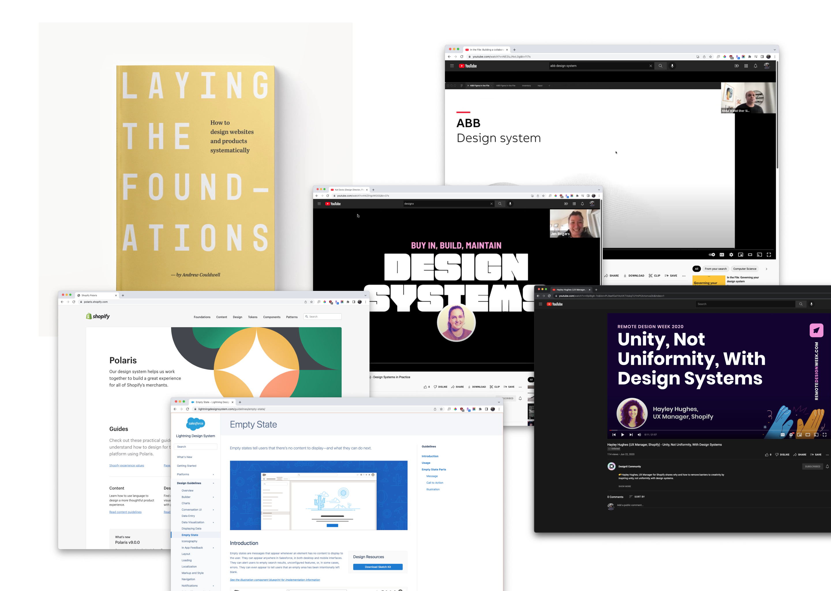
I analyzed well-established design systems (Lightning, Polaris, Thumbprint, etc.), and referenced “Laying the Foundations” by Andrew Couldwell.
Understanding engineering
I held extensive discussions with both Android and iOS engineers to understand technical constraints, how their codebases were set up, and what they needed from design/me. These started out from well-crafted presentation decks, but slowly became just Figma pages filled with content and questions.

Understanding designers + facilitating workshops
There was a range of experience levels of designers in the team. As I got to know them, observed how they worked, and working together on projects, I formed a deep understanding of what types of support provided by the design system or teammates would be most helpful.
I conducted workshops to mentor fellow designers on how to more effectively and efficiently use Figma to build components. I tailored my answers based on the individual’s skill level, and tried my best to structure growth for them over the months that the design system was simultaneously being implemented. Additionally, I also emphasized that this was a collaborative process and would appreciate if they will provide feedback to me to improve the design system for the team.
Design phase
Iterative testing
I constantly seek feedback or observe how my teammates used the system in real time because the design system was being implemented and built simultaneously. Using these data points, I continuously tweaked the design system to better suit the needs of my team.
Onboarding & implementation
Contribution pipelines and rotating designer-of-the-week
Each designer takes on a “designer-of-the week” role. This designer has to vet and approve new or revised components. I created this flow to empower each designer to confidently propose new components and/or patterns. The designers should advocate for their respective work streams that uses this design system.