About product
Singpass is Singapore’s national digital identity system created by the government of Singapore. It is part of the Smart Nation initiative that aims to leverage technology and innovation to improve the quality of lives for those living in Singapore. Singpass has two key features:
- Single sign on — Use the app as a passkey to log into government services or government-approved services. No need to remember passwords.
- Digital identity cards — Use digital identity cards as an official alternative to physical cards.
About project
Government-issued identity cards were going digital and the Singpass app was the home of them. The app was expected to hold more than 10 identity cards, and this project was to
- Design a new feature/experience for users to easily access the specific cards they want
- Allow users to display their primary ID card together with another card in the event that additional verification is required
What did I do?
I designed a completely new card carousel feature that stores multiple cards and can be accessed via a horizontal scroll interaction. As this is a new feature, I also designed an onboarding tutorial that encourage users to learn on-the-go as they have to interact directly with the feature.
Impact
The feature was first launched in April 2021. It was later moved from a subpage to the main home page in October 2021, following the overhaul of the app’s information architecture.
Highlights
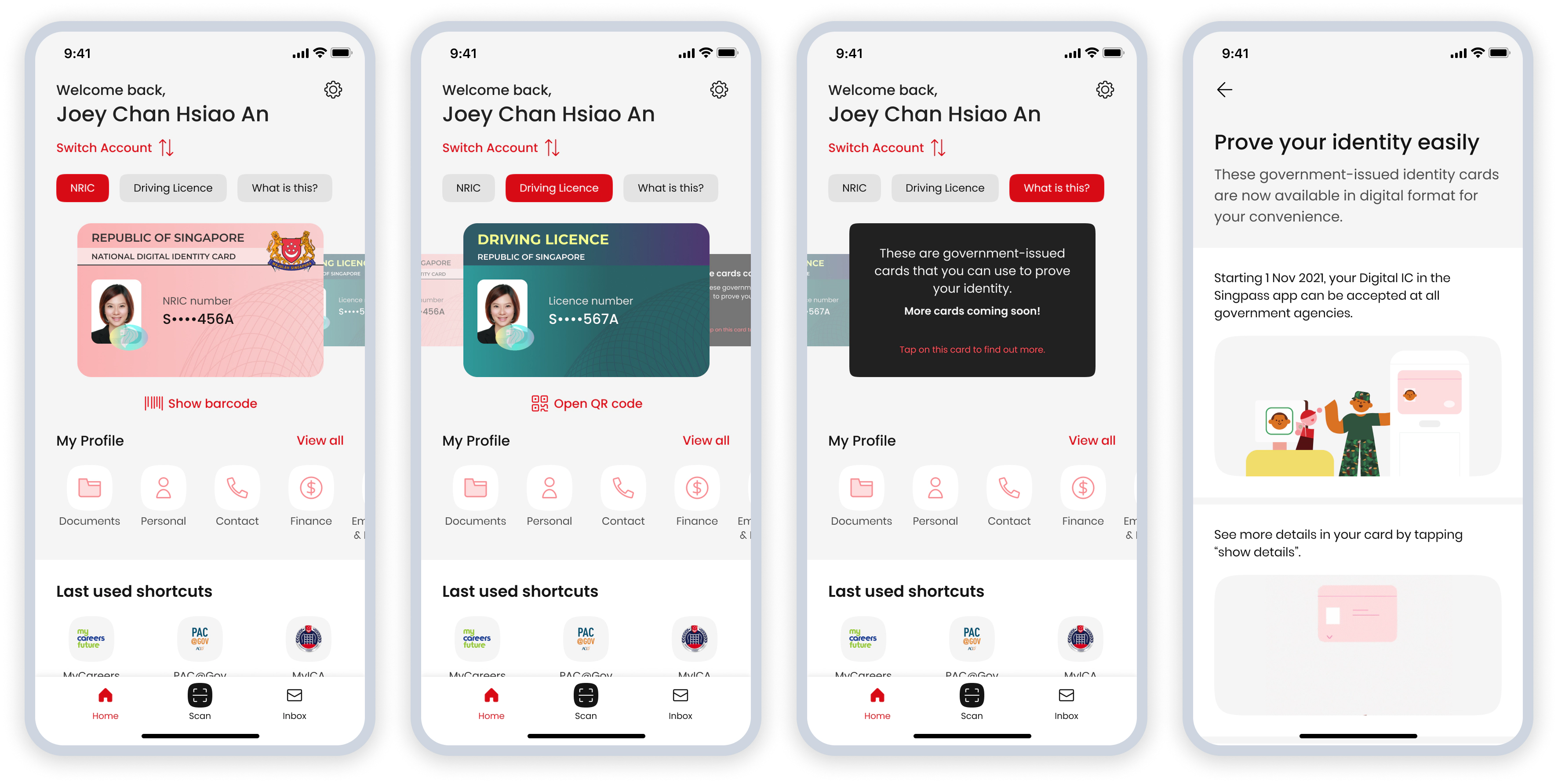
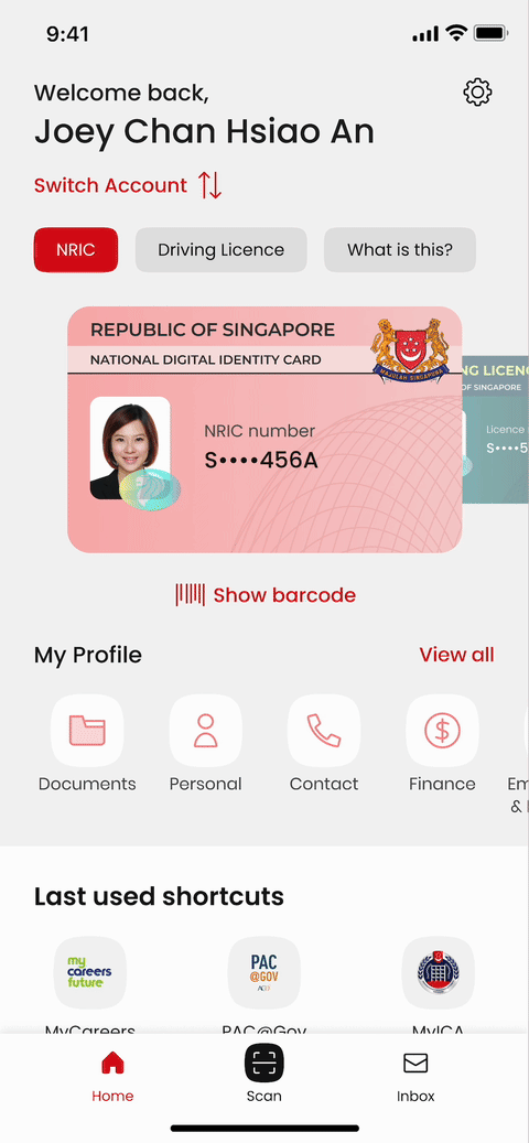
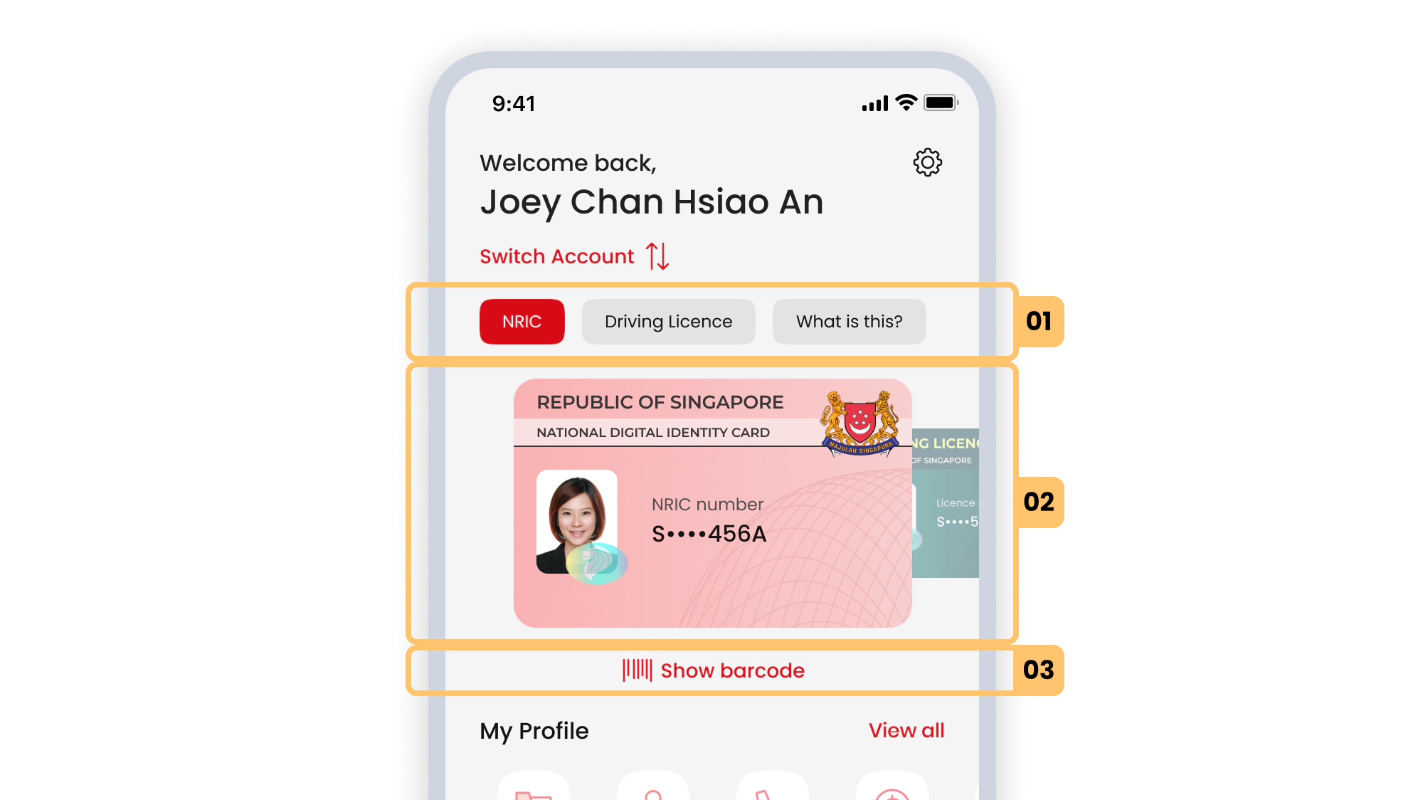
What did it look like?
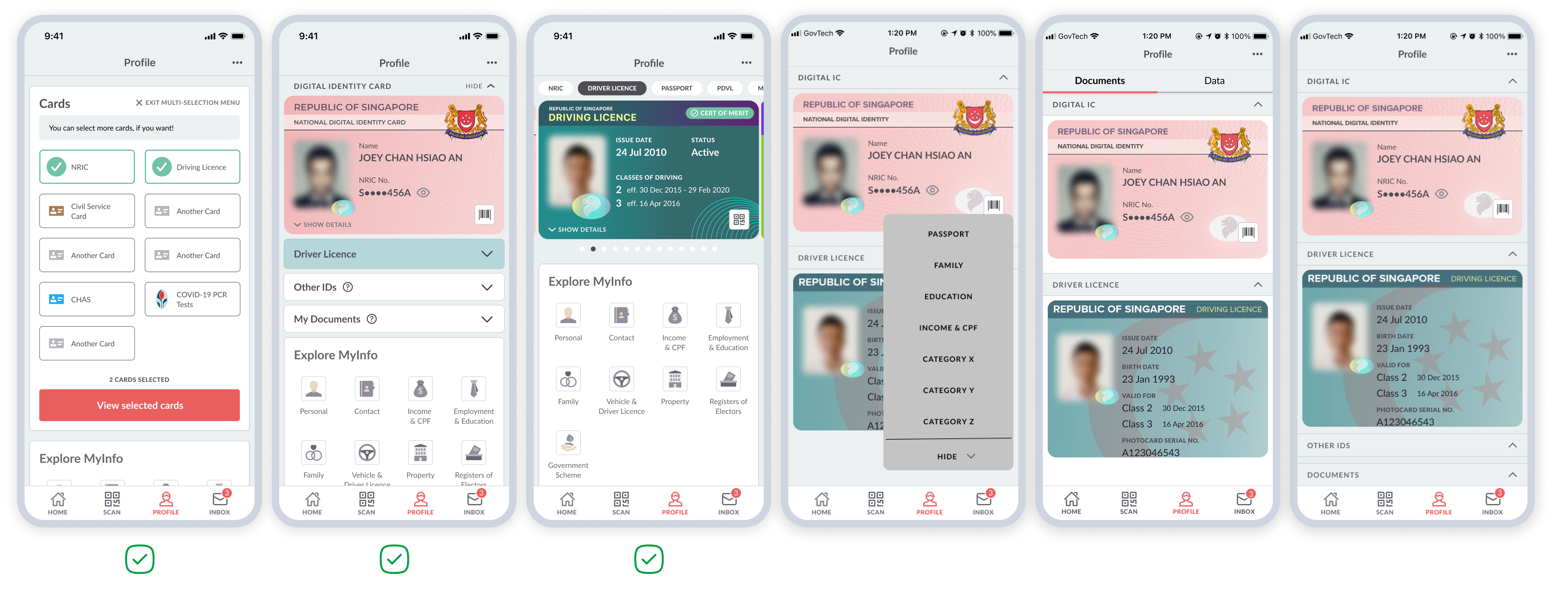
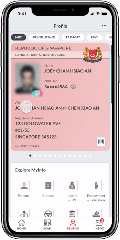
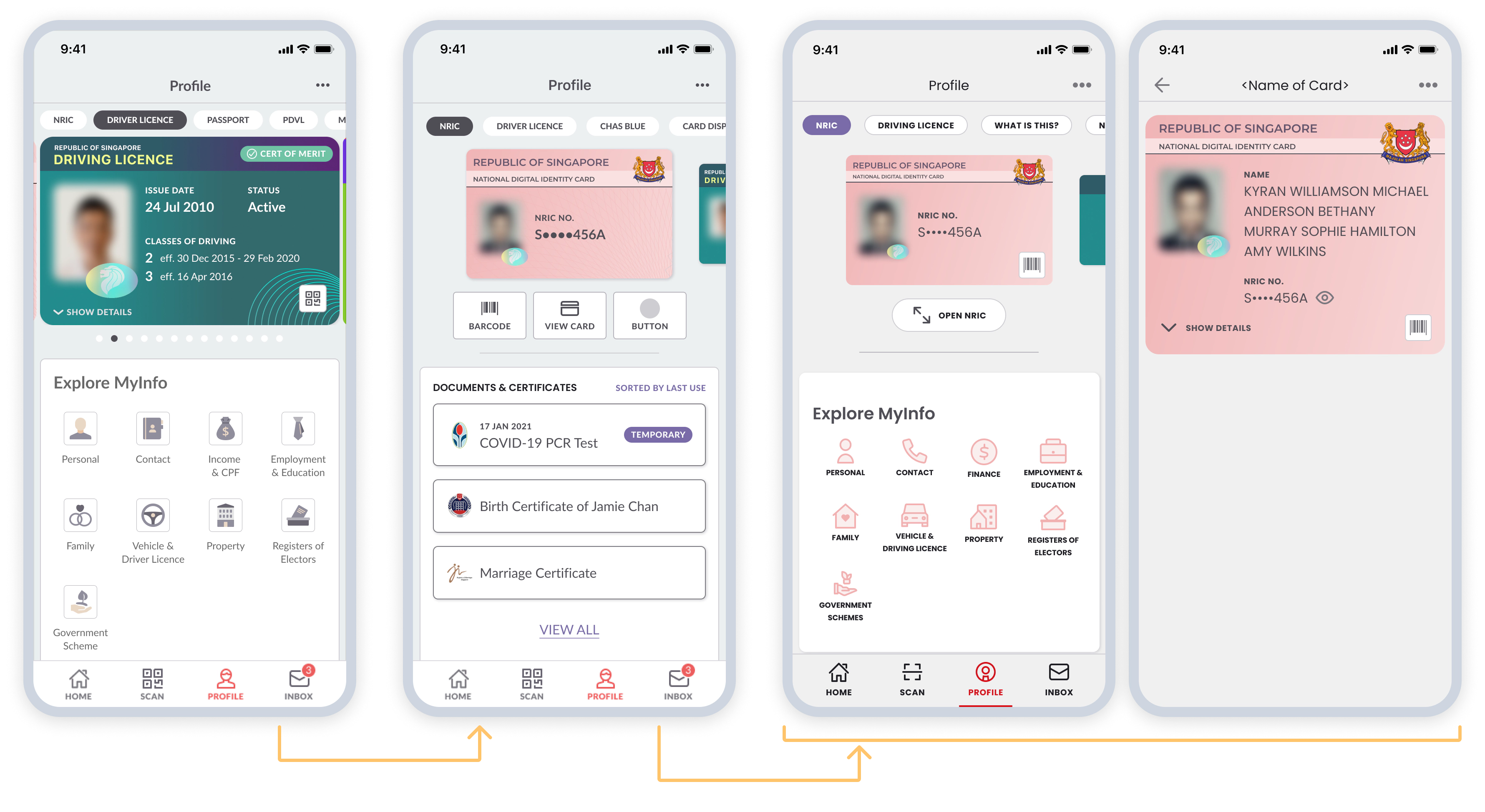
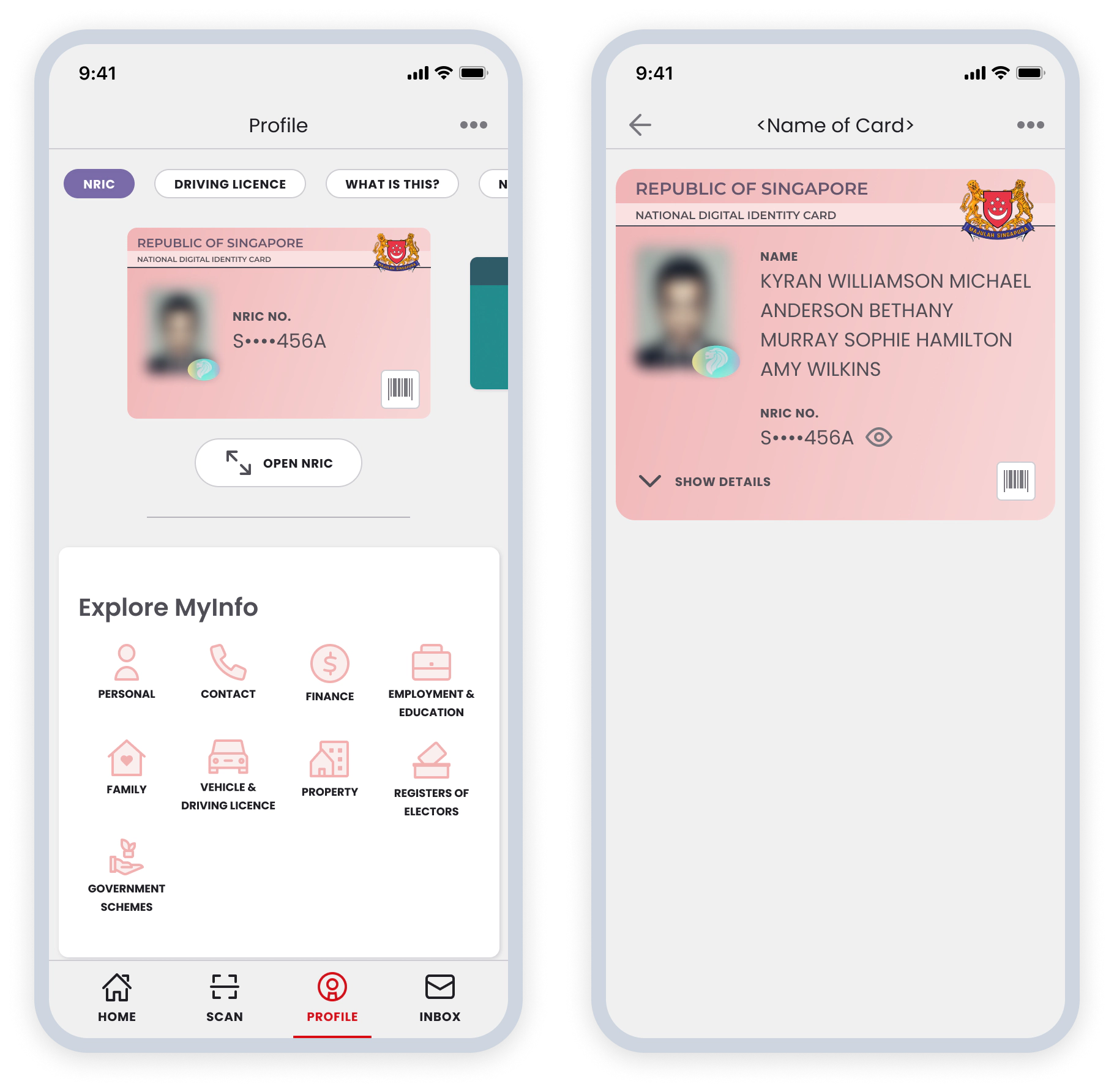
- Row of pills — This shows (a) the name of the card, (b) enables users to scroll through their long list of cards quickly.
- Carousel of cards — Scroll through the cards one at a time. Each card shows the user’s partially truncated unique card identifier, designed in accordance with the Personal Data Protection Act (PDPA) guidelines.
- Quick action button — Access the specific card’s Barcode or QR code directly.
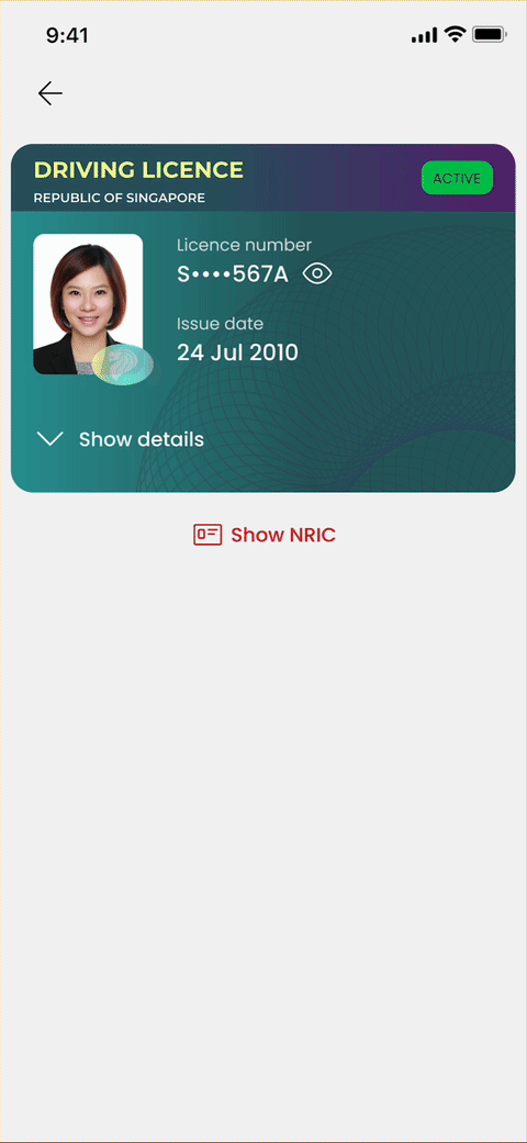
Primary ID card always available
Information displayed on each card is specific to the card’s purpose. Sometimes, there are instances where additional verification of information from the primary ID card is required. As such, the primary ID card (hidden by default) can be opened underneath each card with the tap of a button.
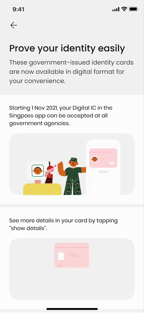
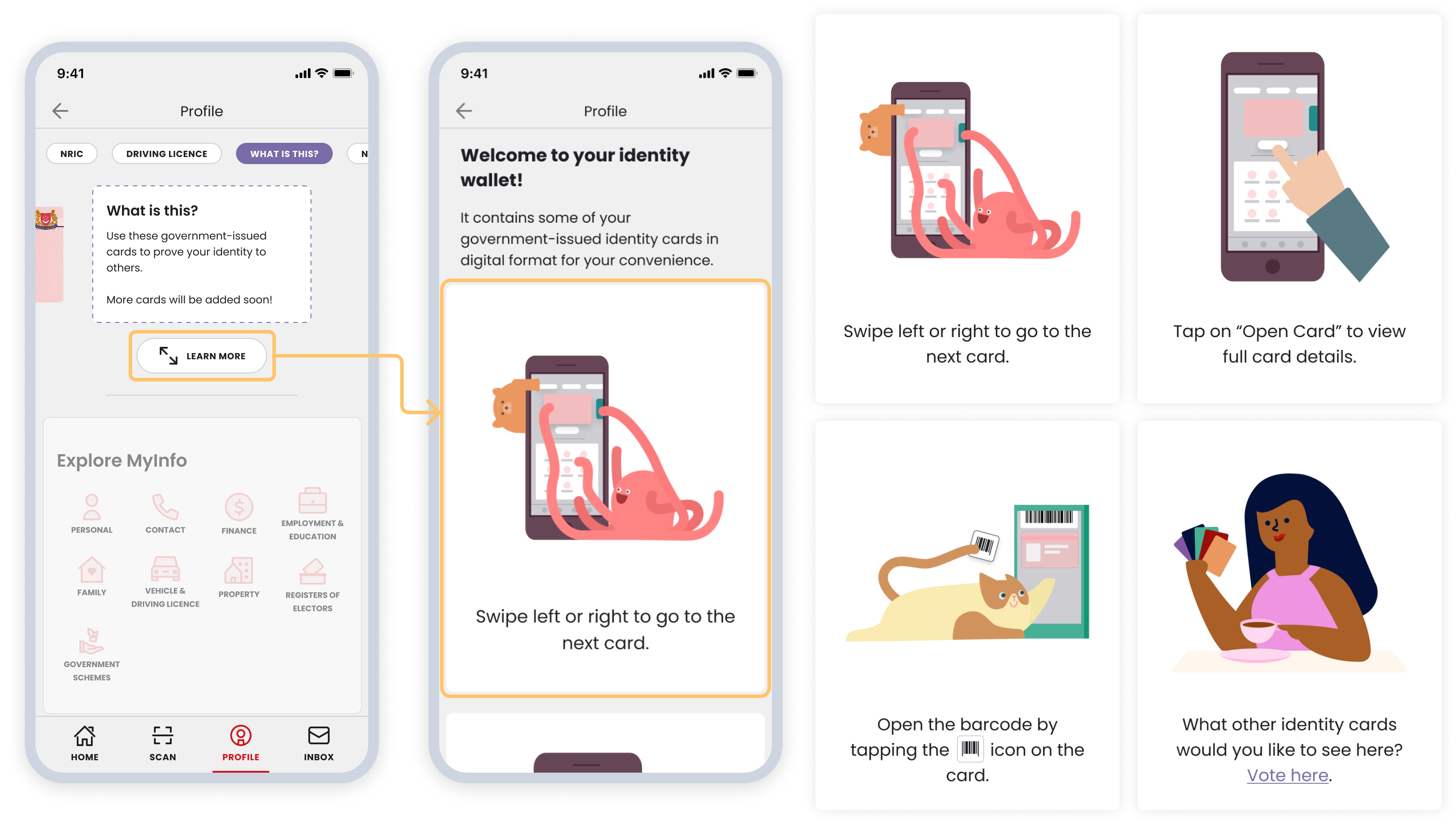
Interactive onboarding guide
It was crucial to provide education on this new feature as the app’s users span all levels of tech savviness. A ‘what is this’ card was launched together with the primary ID card. The card carousel were intentionally designed such that they stacked above one another, signaling to them that they can swipe. Making their first swipe completes the first step of using this feature.
The rest of the onboarding process is straightforward. Users will be shown a page that introduces them to the details of this feature.
Research phase
Co-design workshop
My teammate and I conducted a co-design workshop with our extended team consisting of additional 2 designers, 1 UX researcher, 1 product manager, and 3 engineers. The goal of the workshop was to explore different ways on how and where users might find their identity cards, and how this new feature might be integrated with the rest of the existing features.
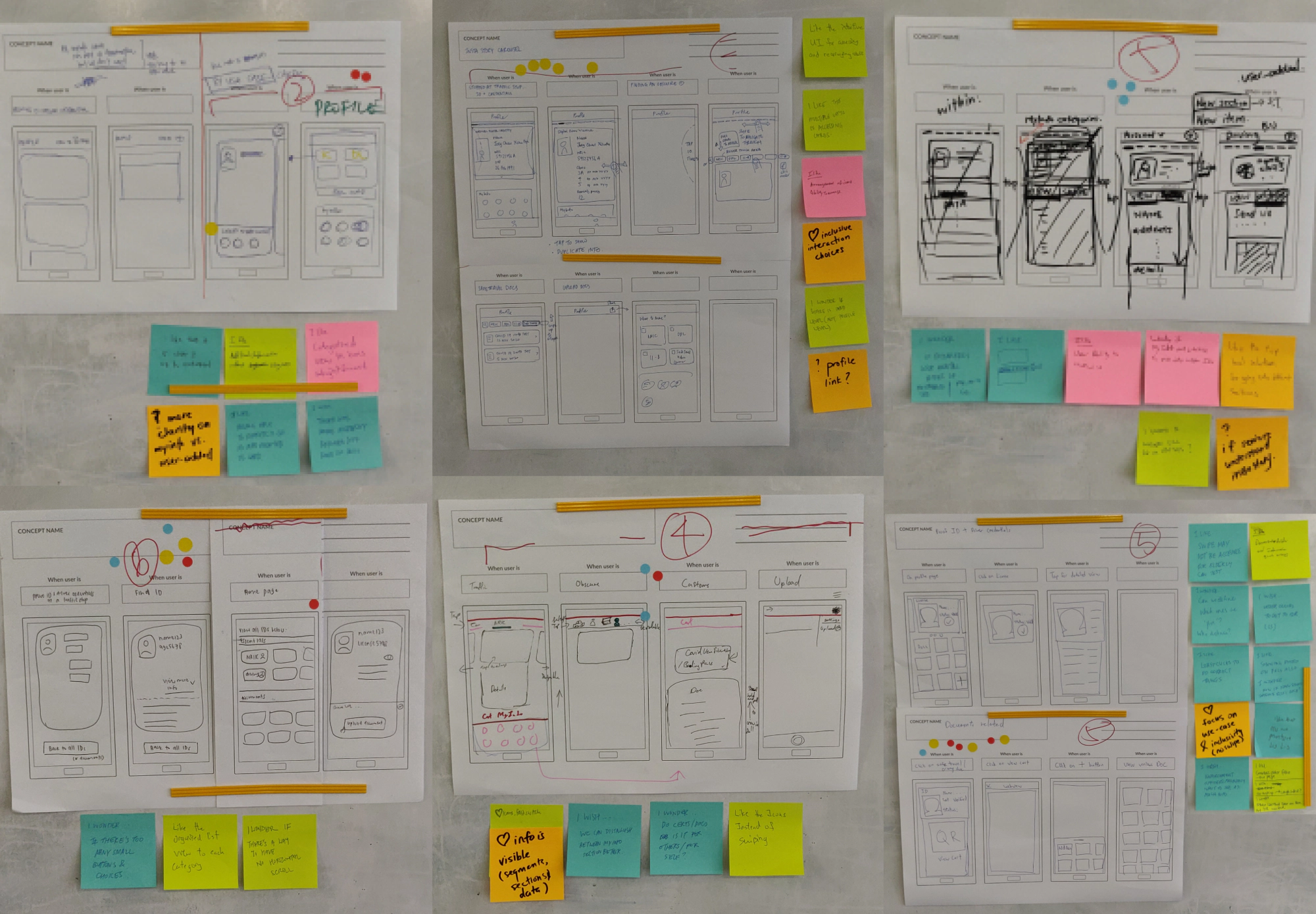
Concepts and prototyping
These are the downselected three ideas from the initial six that the team came up with after rounds of discussions and heuristic evaluation (I proposed four of the six ideas). After defining and mapping out the UX flows to capture the essence of each concept, I built three different prototypes, each covering a little more than just the happy path.
Concept 01
Users select a combination of cards to open together.
Concept 02
Users go through their list of cards by scrolling horizontally.
Concept 03
Users and show or collapse their list of cards, similar to that of an accordion.
Sacrificial concept testing
The goal of the interviews was to capture people’s initial reactions and understand how they might interact with these vastly different interaction patterns, to better inform my final design decisions.
I worked very closely with my UXR teammate to conduct 8 in-person interviews (in rooms with one-way mirrors). Each session consisted of 3 different tasks, where participants were counterbalanced. Towards the end of each interview, we invited participants to arrange paper cut-outs to show us what their ideal layout of the app would be.
Design phase
Concept refinement
The horizontal scroll interaction concept received the highest usability score in the research interviews and was the most popular, with most participants comfortable with scrolling through their cards without additional prompts. I refined the concept by shrinking and overlapping cards to the interaction more apparent.
I partially masked the user’s unique card identifier and relocated personal information to a password-protected second page, accessible with a PIN or facial recognition. The personal information is further categorized, with more sensitive data hidden behind a ‘show more’ button.
Onboarding tutorial
In addition to designing flows for the interactive onboarding tutorial, I used the illustration library to create illustrations for the cards.
What shipped?
April 2021
This feature was launched in April 2021 on the “Profile” page, the third tab on the bottom nav bar.
October 2021
Following the overhaul of the app’s information architecture, the card carousel feature was moved to the homepage to increase its prominence drastically. The October 2021 release also included the implementation of the new visual design language and illustration style.